
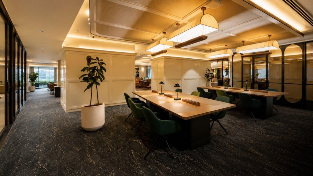
Designing your first office is an exciting milestone. It signals growth, stability and the beginning of a shared workplace culture. But it is also one of the first major physical investments a growing company makes.
The challenge is that most businesses approach office design as a visual exercise. They begin by choosing colours, furniture, finishes and inspiration images before understanding how the space actually needs to function.
A successful office is not simply a place that looks impressive. It must support daily operations, accommodate future growth, improve employee experience and use the available budget responsibly.
Here are five common mistakes companies make while designing their first office, along with practical ways to avoid them.
1. Designing Around the Current Team Size
One of the most common mistakes is planning an office only for the employees working in the company today.
A business may currently have 20 employees, but its office lease could run for three to five years. During that time, the team may grow, departments may change and new ways of working may emerge.
An office designed too closely around the present headcount can quickly become overcrowded. Workstations may be added wherever space is available, meeting rooms may be converted into seating areas and storage may begin occupying circulation zones.
This creates an office that feels improvised rather than planned.
What to do instead
Begin the design process by studying expected growth over the entire lease period.
Create three headcount projections:
- Current team size
- Expected team size within 12 to 18 months
- Maximum realistic team size during the lease
This does not mean building an oversized office from the beginning. It means creating a layout that can adapt.
For example, a flexible collaboration area can initially function as a breakout zone and later accommodate additional desks. Modular furniture can be rearranged as teams expand. Movable partitions can help convert larger rooms into smaller meeting spaces when required.
Also consider how frequently employees will use the office. A hybrid company with 50 employees may not need 50 permanent desks. However, it may need more collaboration areas, phone booths and meeting rooms.
The right question is not, “How many desks do we need?”
The better question is, “How will our people use this office over the next few years?”
2. Prioritising Appearance Over Workflow
Companies often start their office design journey with reference images from social media, design websites or other offices.
These references can be useful, but they should not define the layout.
A visually impressive office can still fail if employees struggle to find meeting rooms, teams constantly interrupt one another or important departments are placed too far apart.
For example, positioning a sales team next to a quiet finance department may create daily distractions. Placing frequently used meeting rooms deep inside the office may cause visitors to move through employee work areas. Locating printers, storage and shared resources without considering movement can create unnecessary congestion.
What to do instead
Map the daily workflow before finalising the floor plan.
Study how employees, visitors, and information move through the office.
Ask practical questions such as:
- Which teams collaborate most frequently?
- Which departments require quiet, focused work?
- How many external visitors arrive each day?
- Where do informal conversations usually happen?
- Which employees spend most of their day on calls?
- What equipment or storage does each team require?
Once these patterns are understood, divide the office into zones.
The reception and formal meeting rooms should usually be placed near the entrance so visitors do not need to enter private work areas. Teams that frequently collaborate should be positioned closer together. Phone booths and call rooms should be easily accessible to sales and customer support teams.
Quiet zones should be protected from cafeterias, collaboration areas and busy circulation paths.
A workplace should reduce friction between people and tasks. Every design decision must help employees move, communicate and concentrate more effectively.
3. Setting a Budget Without Understanding the Full Project Cost
Another major mistake is setting an office interior budget based only on furniture and visible finishes.
A complete office project includes much more than desks, chairs, ceilings and wall treatments. Electrical systems, networking, lighting, air conditioning, fire safety, civil work, acoustics, permissions and professional fees can significantly affect the final cost.
When these elements are not considered at the beginning, companies may overspend during construction or compromise on essential systems toward the end.
This often results in attractive reception areas but inadequate meeting room acoustics, poor lighting or insufficient electrical points.
What to do instead
Divide the budget into clear categories before design begins.
A practical office design budget should account for:
- Civil and structural work
- Electrical and data infrastructure
- Heating, ventilation and air conditioning
- Fire and safety compliance
- Furniture and storage
- Lighting
- Acoustics
- Branding and visual elements
- Technology and meeting room equipment
- Professional fees and approvals
Always maintain a contingency amount for unexpected site conditions or changes during construction. A contingency of approximately 8 to 12 percent can help prevent sudden financial pressure.
It is also important to decide where the company should invest more.
Employee chairs, lighting, acoustics, meeting room technology and air quality usually influence daily performance more than decorative finishes. These elements should not be treated as afterthoughts.
Instead of asking, “How can we make the office look premium within this budget?” ask, “Which investments will improve the workplace experience every day?”
A well-managed budget does not mean choosing the cheapest materials. It means allocating money to the areas that create the highest long-term value.
4. Ignoring Acoustics, Lighting and Employee Comfort
Noise, glare, temperature and poor air circulation are difficult to notice in a drawing or 3D visualisation. However, once employees begin using the space, these issues can become some of the biggest workplace complaints.
Open offices are particularly vulnerable to acoustic problems. Calls, conversations and movement can travel across the floor, making focused work difficult.
Similarly, decorative lighting may look attractive but fail to provide enough illumination at workstations. Strong overhead lights can create glare, while poorly positioned screens near windows can affect visibility.
Air conditioning can also become uneven. Some employees may feel too cold while others experience poor airflow.
What to do instead
Treat comfort as a core design requirement from the beginning.
For acoustics, use a combination of planning and materials. Separate noisy departments from focus areas. Include phone booths for individual calls and small meeting rooms for short discussions. Acoustic ceilings, wall panels, carpets, curtains and upholstered furniture can help absorb sound.
For lighting, combine natural daylight with appropriate artificial lighting. Workstations should receive balanced illumination without direct glare. Meeting rooms need lighting that works for both in-person discussions and video calls.
Air conditioning layouts should be coordinated with workstation placement, partitions and room occupancy. A meeting room designed for ten people requires different ventilation from an open collaboration area.
Ergonomics must also be considered. Employees may spend several hours sitting at their workstations, so adjustable chairs, suitable desk heights and comfortable screen positioning are essential.
Before approving the design, review each space from the employee’s perspective.
Can someone take a confidential call without disturbing others? Is there enough light to work comfortably throughout the day? Can employees move between desks without squeezing past furniture? Will the temperature remain comfortable when meeting rooms are fully occupied?
These questions may not create dramatic photographs, but they determine whether the office works successfully.
5. Trying to Communicate the Brand Through Decoration Alone
Many companies want their first office to reflect their identity. However, brand expression is often reduced to placing a large logo at reception, painting walls in brand colours and adding motivational quotes.
This can make the office appear branded without making it feel connected to the company’s culture.
A workplace brand should be experienced through how the space functions, not only through graphics.
For example, a company that describes itself as collaborative but provides very few shared spaces creates a disconnect. A company that promotes transparency but designs closed, hierarchical cabins sends a conflicting message.
What to do instead
Translate the company’s values into spatial decisions.
If collaboration is important, create a mix of formal meeting rooms and informal discussion areas. If learning is central to the culture, provide spaces for training, workshops and knowledge sharing.
If employee well-being is a priority, include comfortable breakout areas, access to daylight and places where people can step away from their desks.
If the organisation wants to appear open and approachable, consider visual connections between spaces, accessible leadership areas and fewer physical barriers.
Brand colours and graphics can still be used, but they should support the overall experience rather than dominate it.
The best office branding is subtle. Employees and visitors should understand something about the organisation simply by observing how the workplace operates.
A Practical First-Office Design Process
The easiest way to avoid these mistakes is to follow a clear sequence
Step 1: Create the workplace brief
Document the current team size, projected growth, departments, working patterns, visitor requirements and operational needs.
Step 2: Study the site carefully
Review natural light, entry points, ceiling height, columns, existing services, emergency exits and building restrictions before planning the layout.
Step 3: Map workflows
Identify which teams need proximity, which roles require privacy and how visitors, employees and materials will move through the office.
Step 4: Define the budget
Include construction, systems, furniture, technology, approvals and contingency costs.
Step 5: Finalise the layout before finishes
Approve zoning, circulation, seating, meeting rooms, storage and utilities before selecting colours and materials.
Step 6: Coordinate all services
Ensure electrical, networking, lighting, air conditioning, fire safety and furniture plans work together.
Step 7: Test the office before completion
Review workstation dimensions, lighting levels, sound control, meeting room technology and circulation on-site before final handover.
Final Thoughts
Your first office does not need to be the largest or most expensive workplace in your industry. It needs to be thoughtful.
A well-designed office helps people focus, collaborate and grow without requiring constant modifications. It reflects the organisation’s culture while remaining practical enough to support everyday work.
Start with how the company operates. Plan for change, understand the complete budget and prioritise employee comfort before decorative details.
The goal is not simply to complete an office interior project.
The goal is to create a workplace that continues to work as the business grows.