Most office designs are chosen based on what looks professional or, worse, whatever neutral beige was already on the walls.
But color isn’t just a backdrop-it’s a psychological trigger. It influences heart rates, hormone levels, and even how fast time seems to pass.
If your team is sluggish, anxious, or hitting a creative wall, the problem might not be the workload. It might be the paint. Understanding office color psychology is the ultimate low-cost, high-impact hack for optimizing your workforce.
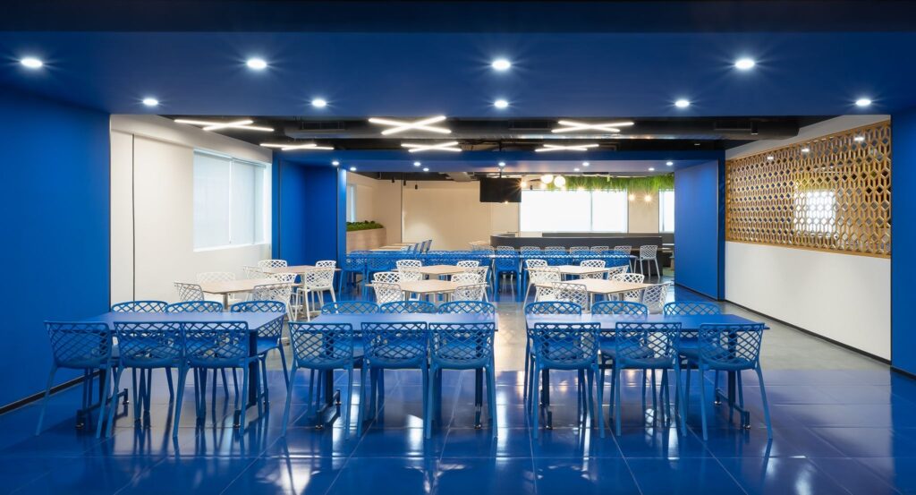
1. Blue: The Productivity Powerhouse
Blue is the most universally effective color for work environments. It is associated with the sky and the ocean, triggering a sense of stability and calm.
The Effect? It lowers heart rates and helps employees stay focused on repetitive or detail-oriented tasks.
Best For- Accounting, data entry, and legal departments where accuracy and long-term deep work are essential.
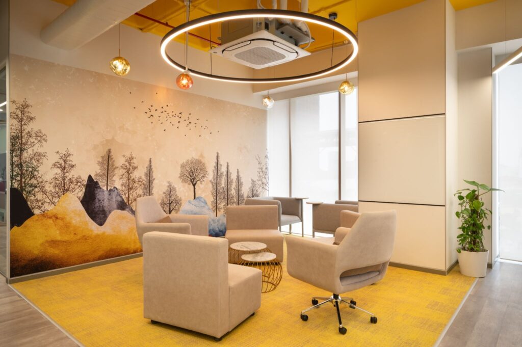
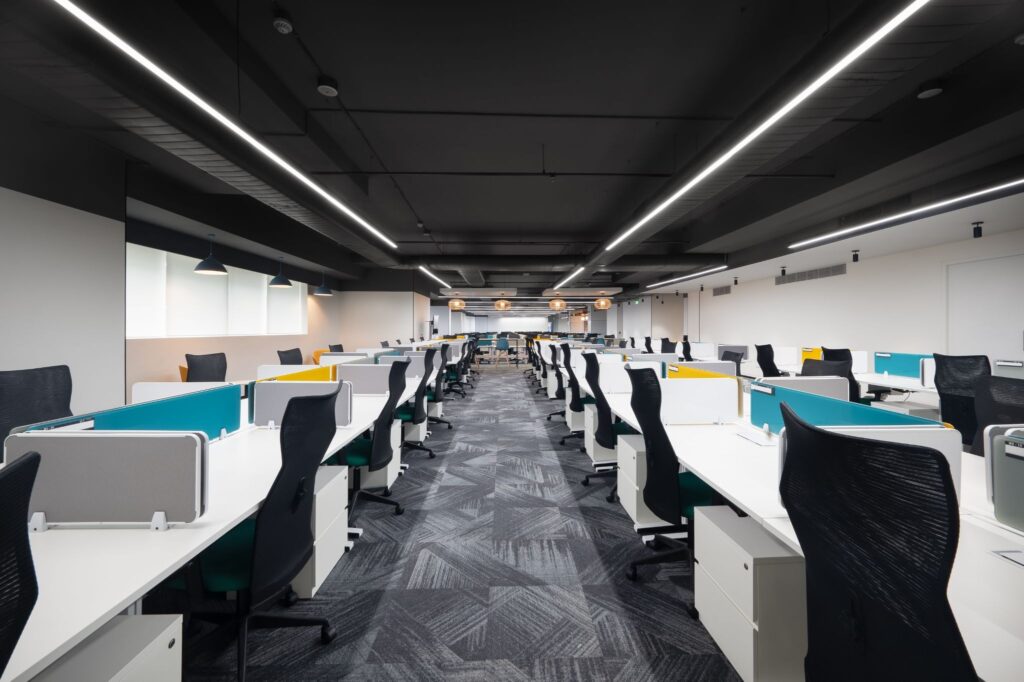
2. Yellow: The Spark of Innovation
Yellow is the optimist of the color wheel. It triggers the release of serotonin, making people feel more energetic and upbeat.
• It stimulates the ego and the spirit, making it perfect for creative problem-solving and brainstorming.
• Best for ? Design studios, marketing agencies, and collaborative zones. Use it as an accent rather than a flood- too much yellow can lead to eye strain and irritability.
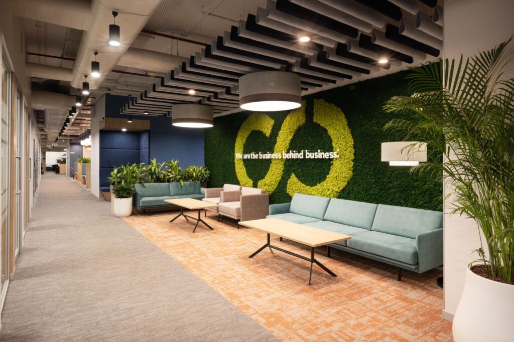
3. Green: The Stress Neutralizer
Green is the color of growth and nature. It is the easiest color for the human eye to process, meaning it provides immediate “visual rest.”
• It reduces anxiety and mental fatigue. Research shows that employees in “green” offices (including those with plenty of plants) take fewer sick days.
• Best For? High-stress environments like financial trading floors or customer support hubs where keeping a “cool head” is critical.
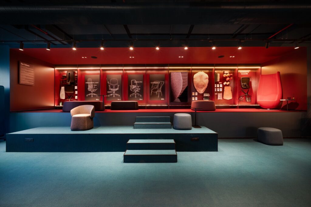
4. Red: The Physical Catalyst
Red is a high-wavelength color that physically stimulates the body. It increases heart rate and blood flow, creating a sense of urgency.
It keeps people alert and physically active. However, it can also increase aggression if overused.Best For: Gyms, warehouses, or breakrooms where people stay for a short time to “recharge” their energy. It’s also great for negotiation rooms where you want to project power.
5. Teal & Soft Greys: The New Professionalism
Pure white can feel clinical and cold (the “hospital effect”), while stark black can be oppressive. Modern offices are shifting toward teals and greiges.
These colors provide a sophisticated, modern feel that doesn’t distract. They act as a “blank canvas” that allows other elements (like tech or art) to pop.Best For: Shared workspaces and reception areas where you want to project a balanced, reliable brand image.
Common Mistakes: Why Your Office “Feels” Wrong
The “Clinical White” Trap
Many founders default to white for a “clean” look. In reality, stark white can be physically painful to look at under bright LED lights and leads to more errors in detail-oriented tasks compared to blue or green environments.
Ignoring “Color Saturation”
It’s not just the color; it’s the intensity. A bright, neon blue will overstimulate, while a soft, muted blue will calm. High-intensity colors are for active zones, low-intensity colors are for focus zones.
Forgetting Brand Identity
Your office is a physical manifestation of your brand. If your brand is “bold and disruptive,” but your office is “pale beige,” there is a psychological disconnect for both your employees and visiting clients.
Paint Your Way to Success
Your workspace color palette shouldn’t be an afterthought. It is a silent manager that directs the energy of your room. By strategically applying these psychological principles, you turn your walls into a tool for better mental health and higher output.
Ready to give your office a psychological upgrade?
Start small-re-paint a single focus room or add strategic accents to your common areas. You’ll be surprised how a simple shift in hue can completely shift the mood of your team.