
The colors we choose for our workplace design significantly influence workplace color psychology, employee mood, employee experience, productivity, and overall workplace culture. Understanding the psychology of color in workplace design can help create an environment that enhances both well-being and performance. Here’s a closer look at office design color psychology and color meaning in office design:
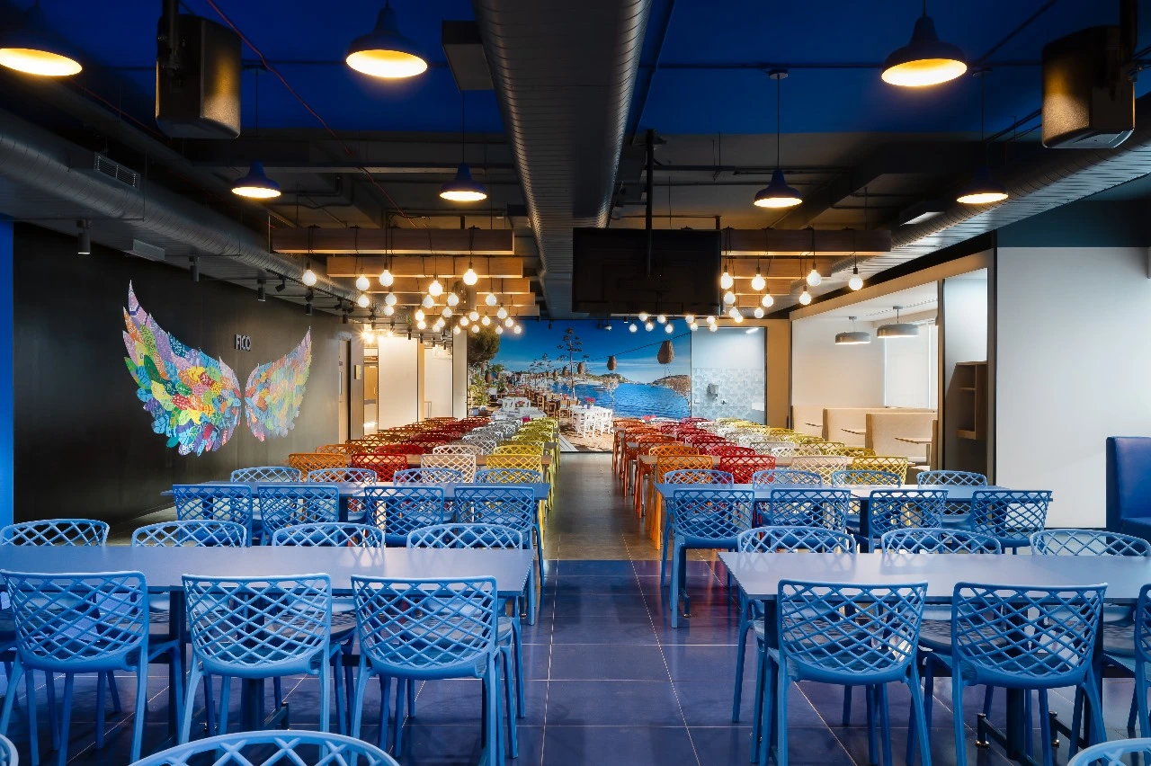
Blue
Impact: Known for its calming effects, blue promotes focus and productivity. It can help lower stress levels, making it ideal for environments where concentration is key
Application: Use in offices where analytical work occurs or in conference rooms to encourage calm discussions.
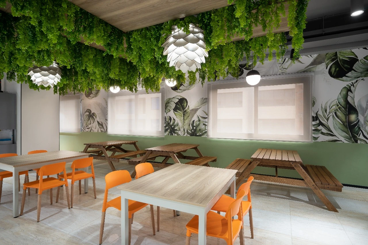
Green
Impact: Green represents nature and harmony. It reduces anxiety and enhances creativity and balance—another example of color meaning in office design.
Application: Perfect for collaborative spaces or lounges, supporting innovative areas and reinforcing office color schemes for creativity.
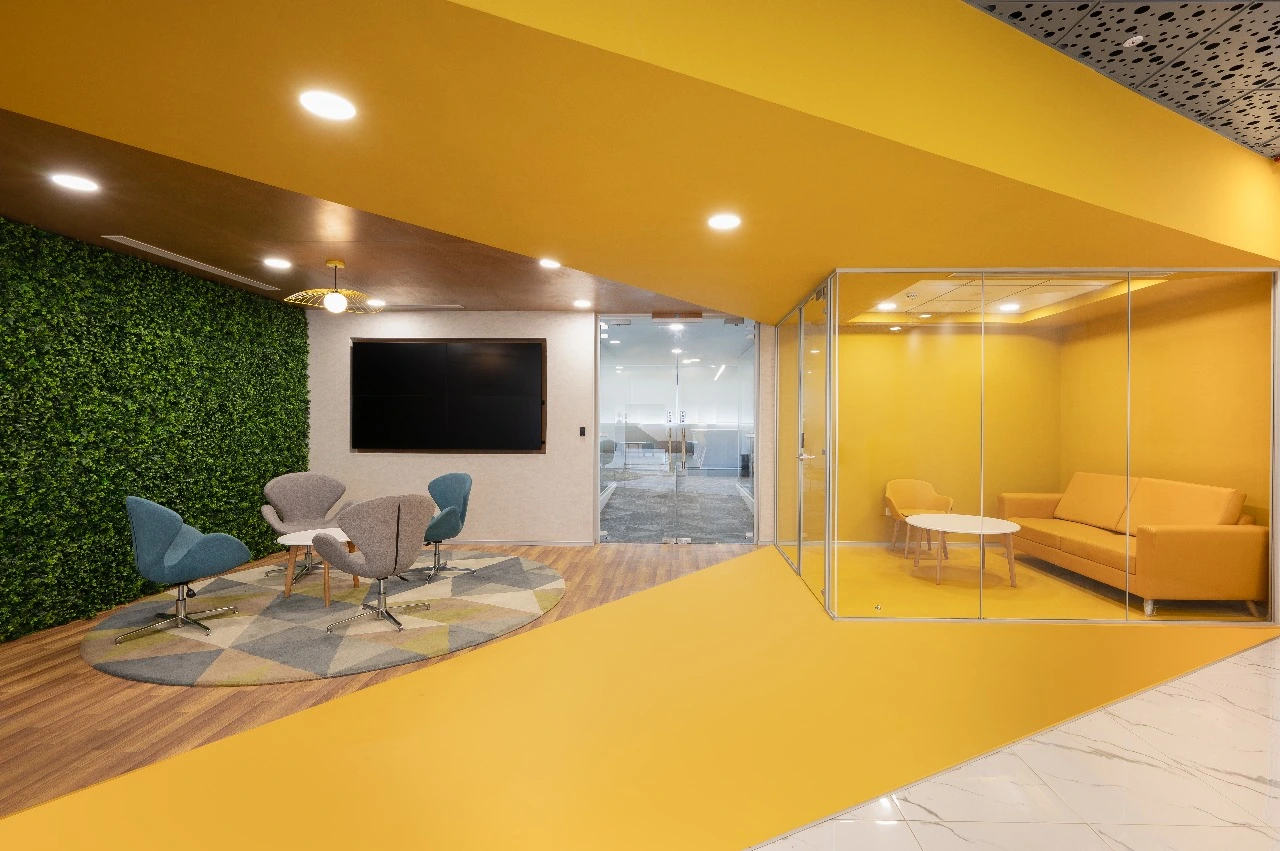
Yellow
Impact: Yellow stimulates creativity and optimism. It increases energy levels and fosters a positive environment—highlighting using color in office design to spark imagination.
Application: Ideal for brainstorming zones or spaces seeking out-of-the-box thinking—one of the recommended colors to boost workplace productivity.
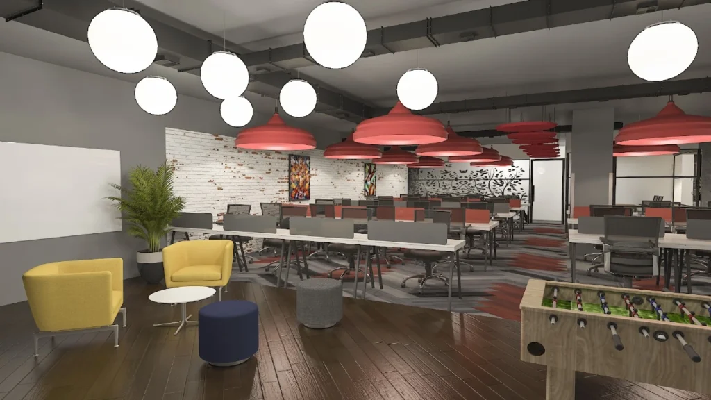
Red
Impact: Associated with energy and urgency, red stimulates action and quick decision-making—showing how varying colors impact performance.
Application: Best used sparingly as an accent in high-energy areas, such as sales or motivational zones—illustrating energizing colors for collaborative space.
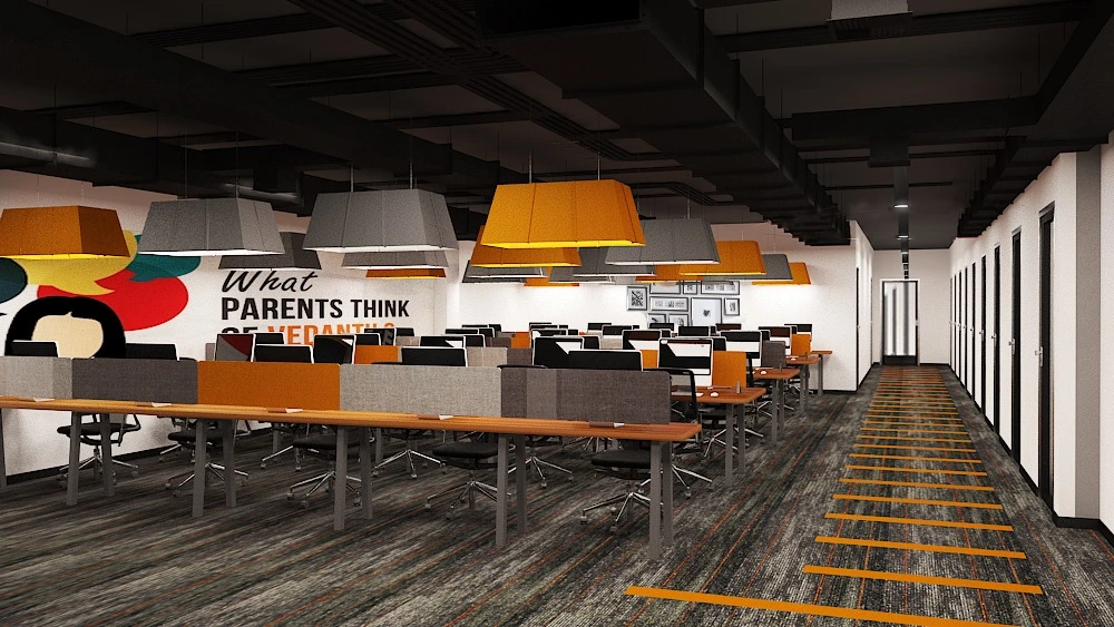
Orange
Impact: Orange encourages enthusiasm and social interaction—an energizing hue in the palette.
Application: Great for team collaboration spaces or break rooms to reinforce using color in workplace zones and inspire engagement.
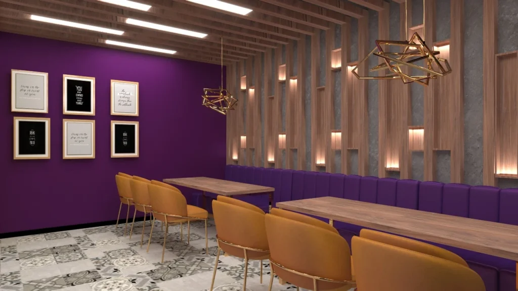
Purple
Impact: Often tied to creativity and inspiration, purple promotes a calm yet imaginative atmosphere—another key insight in workplace color psychology.
Application: Fit for creative workspaces, art studios, or innovation labs—part of thoughtfully curated office color schemes for creativity.
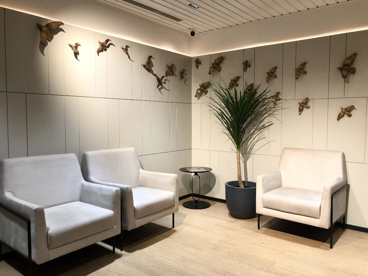
Neutrals (White, Gray, Beige)
Impact: Neutrals provide a clean, modern backdrop and balance bolder colors—acting as a calm anchor in design, central to calming colors for workspace design.
Application: Ideal as base tones for larger areas, allowing accent colors to shine without overwhelming the senses—maintaining design clarity.
Conclusion
Incorporating the right hues based on color psychology workplace design can uplift employee morale, enhance employee productivity, and strengthen your company’s culture. By understanding these psychological impacts, organizations can create spaces that not only look appealing, but feel intentional, supportive, and performance-driven.